 Running Facebook ads is one element, but there are multiple elements that make up a system that allows you to run successful Facebook ads. In my free video ‘the 5 must have elements of successful Facebook ads’ I share this system with you.
One of the elements is your landing page, or also called opt-in page. This part of the puzzle is extremely important as it’s the gateway to your list growth. If you have a landing page that doesn’t convert (i.e. turn viewers into subscribers) you are wasting your money on Facebook ads.
A high converting opt-in page ensures that the people who click on your ad to learn more or sign up actually do sign up by giving you their email address in exchange for your free offer. Your ad is there to drive traffic to that landing page, to entice them enough to click to get more information. Your opt-in page is there to convince people that they simply cannot resist what you have to offer.
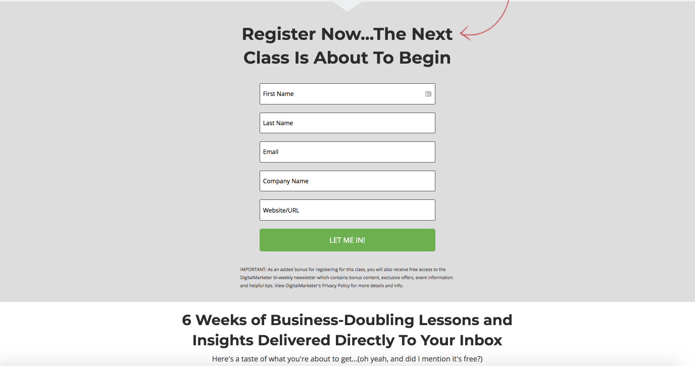
In this post I’m going to uncover the five elements that make up a high-converting opt-in page. I’ll also show you how you can optimise your opt-in pages so that everyone who clicks on your ad actually becomes a subscriber to your list and I’m going to share a few examples of great landing pages that I found through Facebook ads so you know what to focus on.
1: Headline
A converting headline is clear, concise and communicates exactly what the person will be getting when they sign up to your list. It focuses on the benefits which helps the person understand why they really want it. The opt-in page doesn’t focus on the features necessarily, it’s the benefit that convinces them to sign up. Your headline needs to be extremely clear so that anyone will understand what it is you are offering. This is not a time to try fancy language or cryptic descriptions.
2: Images
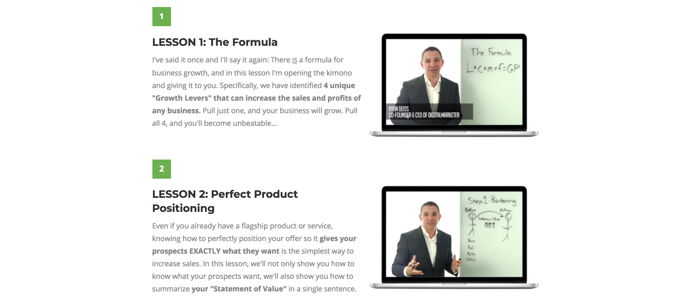
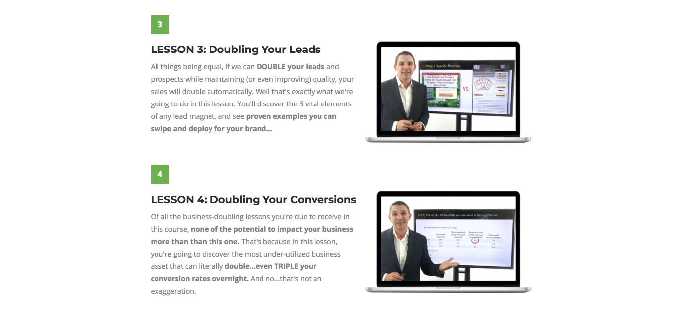
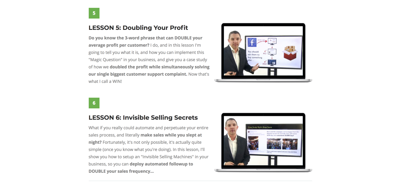
A lot of us are visual, so images tend to stand out before copy. The images on your opt-in page are there to support the copy and helps create a positive visual experience for the viewer. A good image for a landing page is related to what you’re offering, keeps it clear and resonates with your audience.
Creating consistent visual branding throughout the ad and the landing page is important too because it tends to give people more of a sense of security, and they feel safer, and they trust you more. The idea is that they recognise your brand, or at least your brand style when your Facebook ad and landing page are similar.
3: Copy
When writing copy for your opt-in page it’s important to remember that less is more. Opt-in pages tend to be very short and focus on simply delivering your free gift. The fewer words you use in your copy, the better. The focus is on being clear, concise, to tell your audience exactly what they’ll be getting, and why it matters to them.
4: CTA (call to action)
The call to action button is the button that tells your audience exactly what to do. Sadly we tend to be procrastinators and fence sitters, so you need to tell people exactly what you want them to do.
The copy on your call to action button generally sounds like something bossy like, “Shop now, sign up, click here.”
Be very clear with the copy on your call to action button, tell people exactly what you want them to do. Be sure that there are no distractions, so they only option they have is to add their email address and click the call to action button (or leave the page).
Make sure your opt-in button really stands out too by making it a contrasting colour to the colour on the background or in the majority of your opt-in page.
5: Capture form
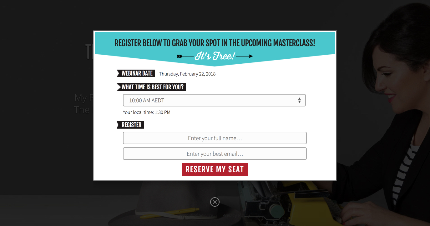
The fifth element of a high-converting opt-in page is a good lead capture form. The general rule for a good lead capture form is the less information you ask for, the more likely people are to take action. When you’re asking for a whole lot of information people tend to tune out and move away from taking action, so the advice is to ask for no more than their first name and email address. You can only ask for an email address but this means that you won’t be able to personally address the person in your emails so I tend to ask for a name but it is entirely your choice.
Example landing pages
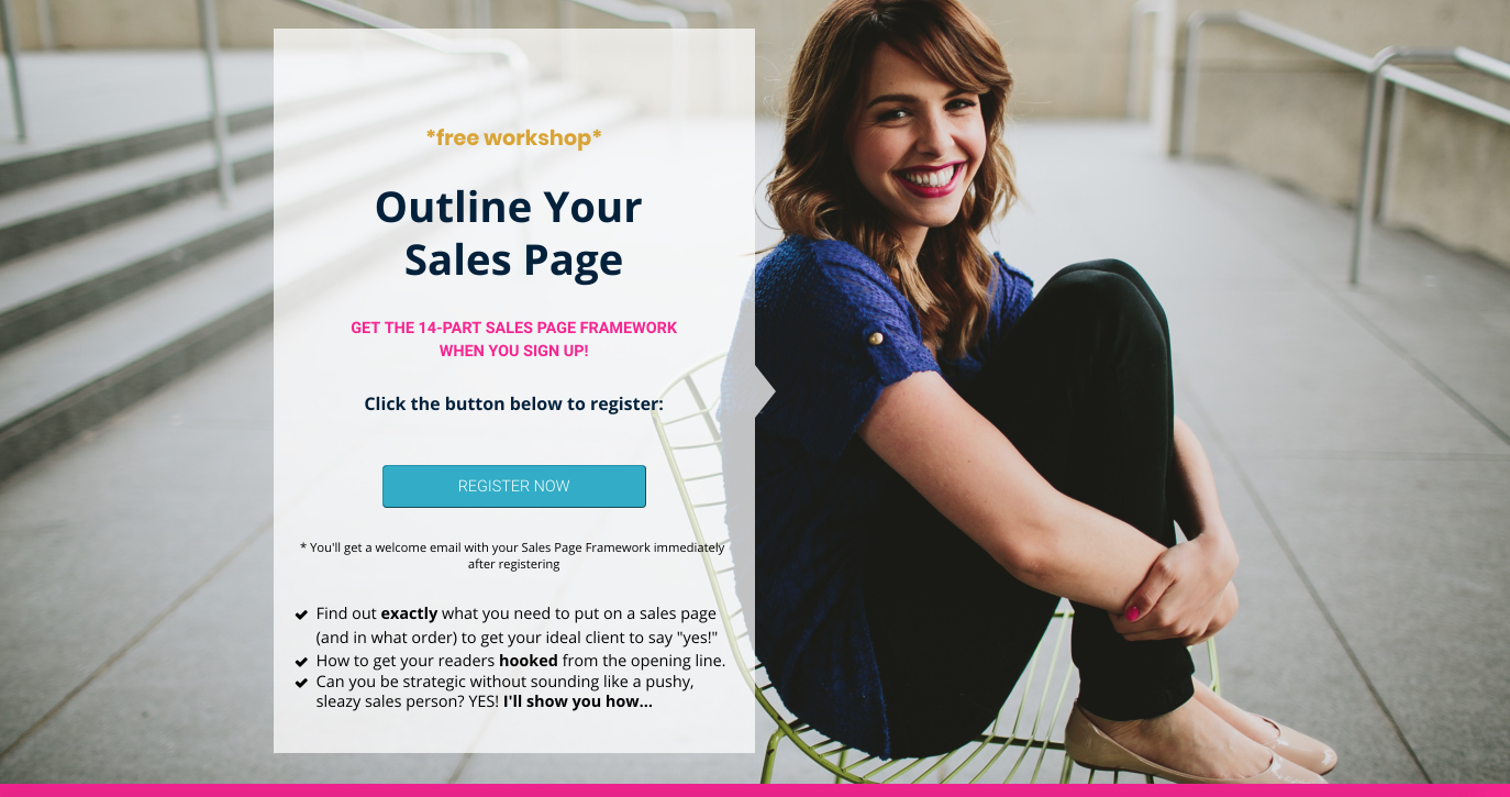
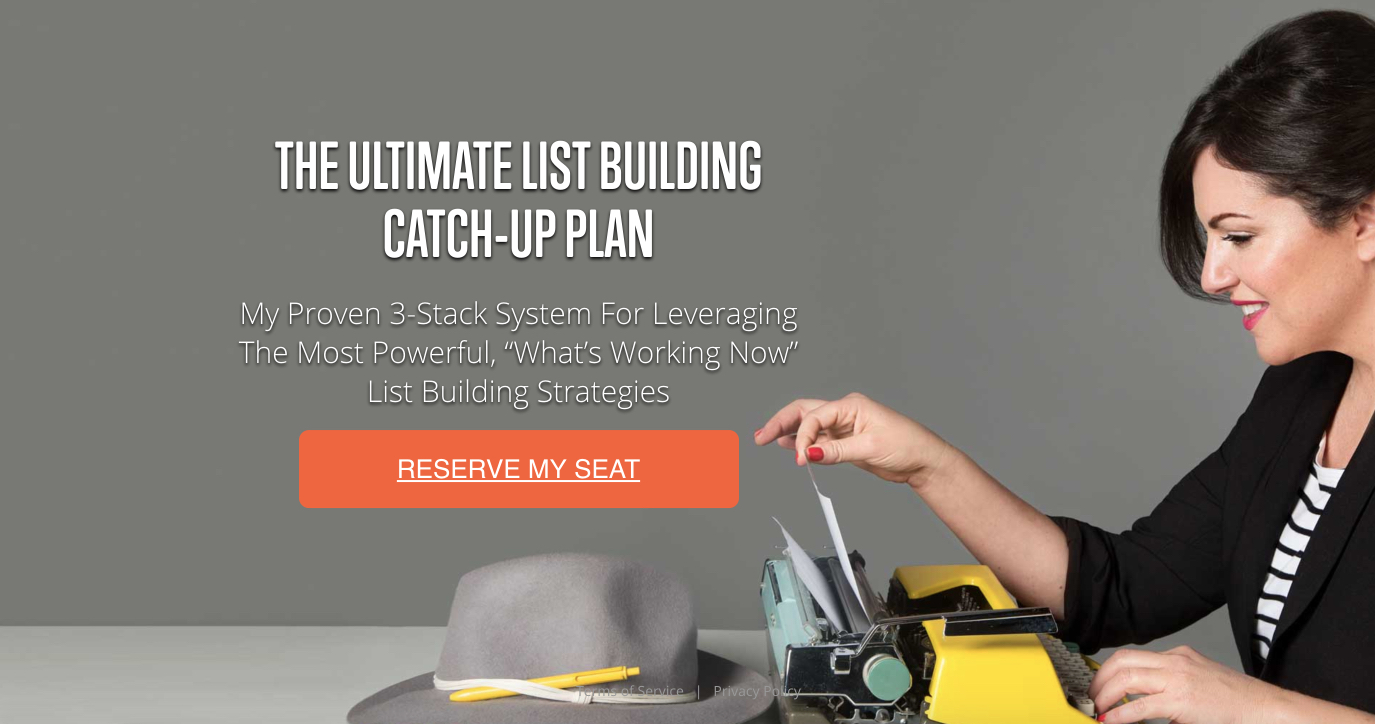
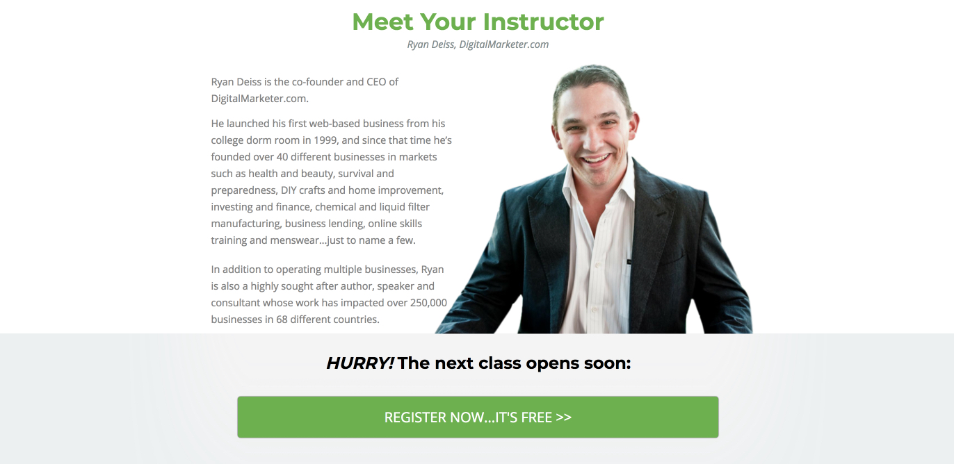
Let’s look at some high converting landing pages that I have collected. Pay particular attention to each of the elements mentioned above and you’ll be able to see why each of these pages performs well.
Now you have a better understanding what makes up a high-converting opt-in page and you’ve been given an insight on how the pros do it. The next time you’re running Facebook ads for list building, you’ll know exactly how to create a landing page that’s going to convert. If you’re unsure of which other elements you’ll need to run successful Facebook ads, please join my free video training and find out more.

